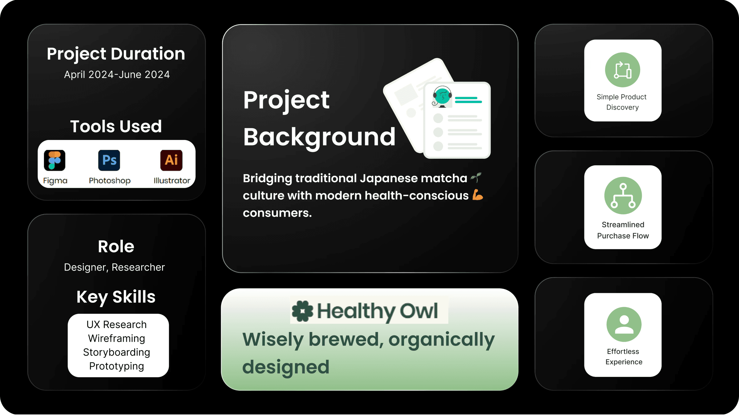
My Journey with Healthy Owl🍀
As Healthy Owl's founding designer, I was a key player in shaping the company's user experience and visual branding.🖼️During the project, I helped deliver designs that aim to make a positive impact on Healthy Owl's growth story.💹
Core problem 🔁
Users visiting matcha websites encounter challenges such as unclear product descriptions, overwhelming navigation, and a lack of engaging content that showcases matcha’s unique cultural and health benefits🌱
These issues create friction in the user journey, making it difficult to trust product quality, find relevant information, or complete purchases seamlessly. 🥲
To address these pain points, the design must focus on delivering an intuitive, visually appealing, and user-friendly experience that highlights matcha’s story while simplifying the path to purchase.
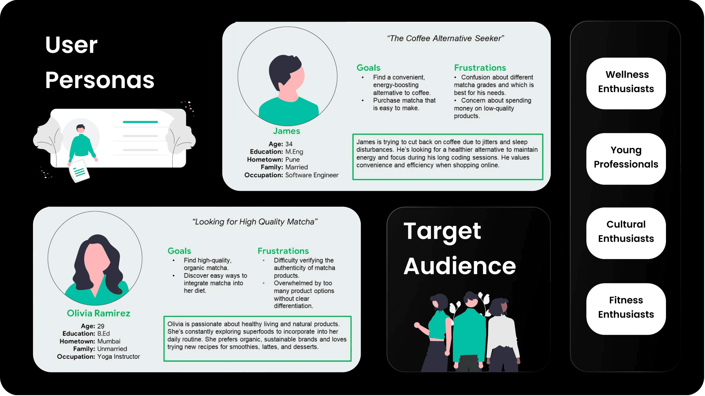
In designing the Healthy Owl app, I addressed the key user pain point of confusion around matcha grades by implementing an intuitive, storytelling-driven interface.
Through carefully crafted visual narratives and interactive grade comparison features, I transformed complex matcha classification into an engaging and educational experience for users. This gave Healthy Owl a competitive advantage over other E-commerce websites. By prioritizing user comprehension and creating an immersive product exploration journey, the application bridges the knowledge gap and enhances the overall purchasing experience.
Key Actions Taken 📱
Simplified product discovery that can be accessed through every page
Providing immersive matcha education with interactive experience for new users and potential new clients
Seamless navigation between product exploration and purchase
Engaging visual storytelling that makes the users enjoy using the Healthy Owl application
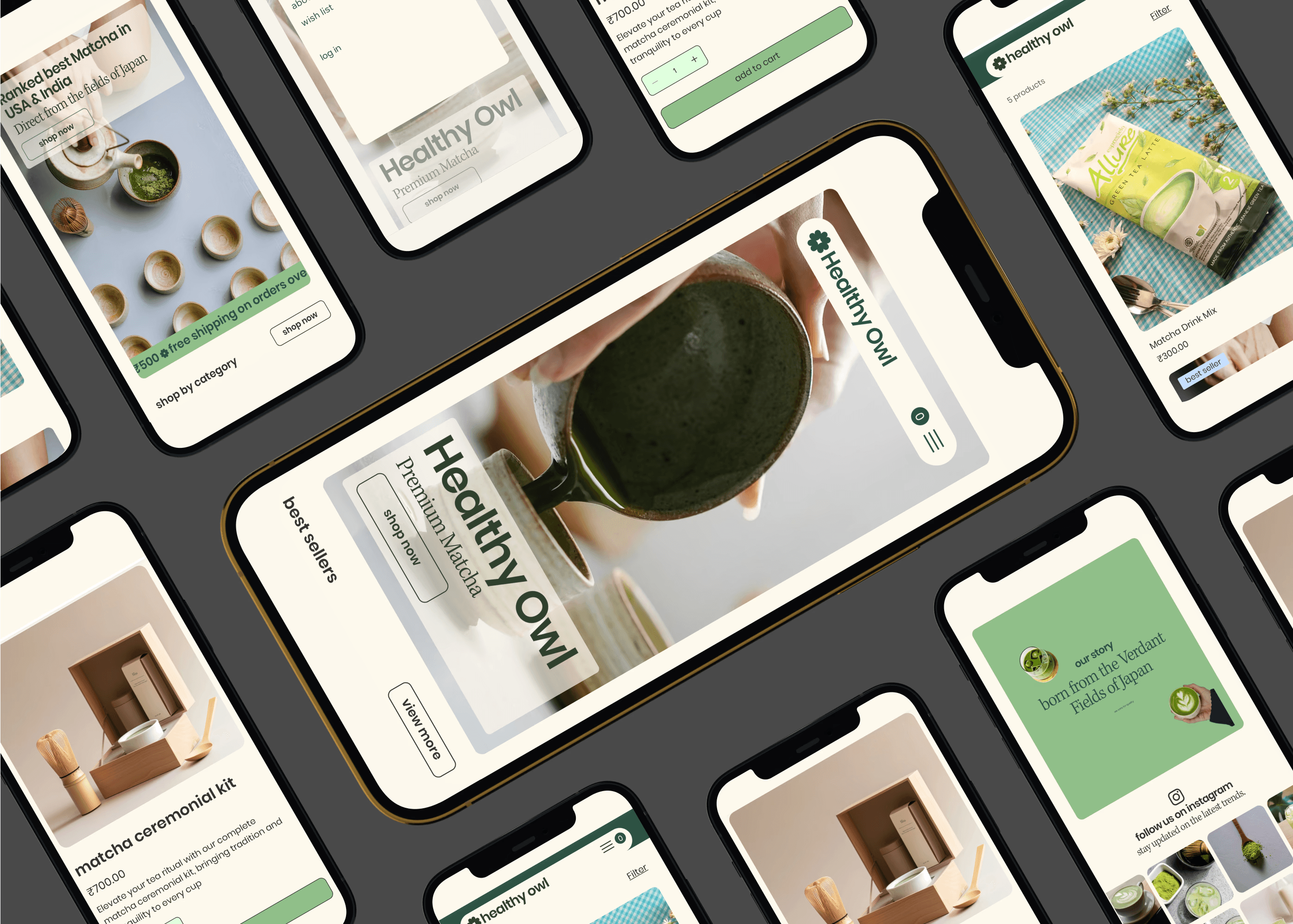
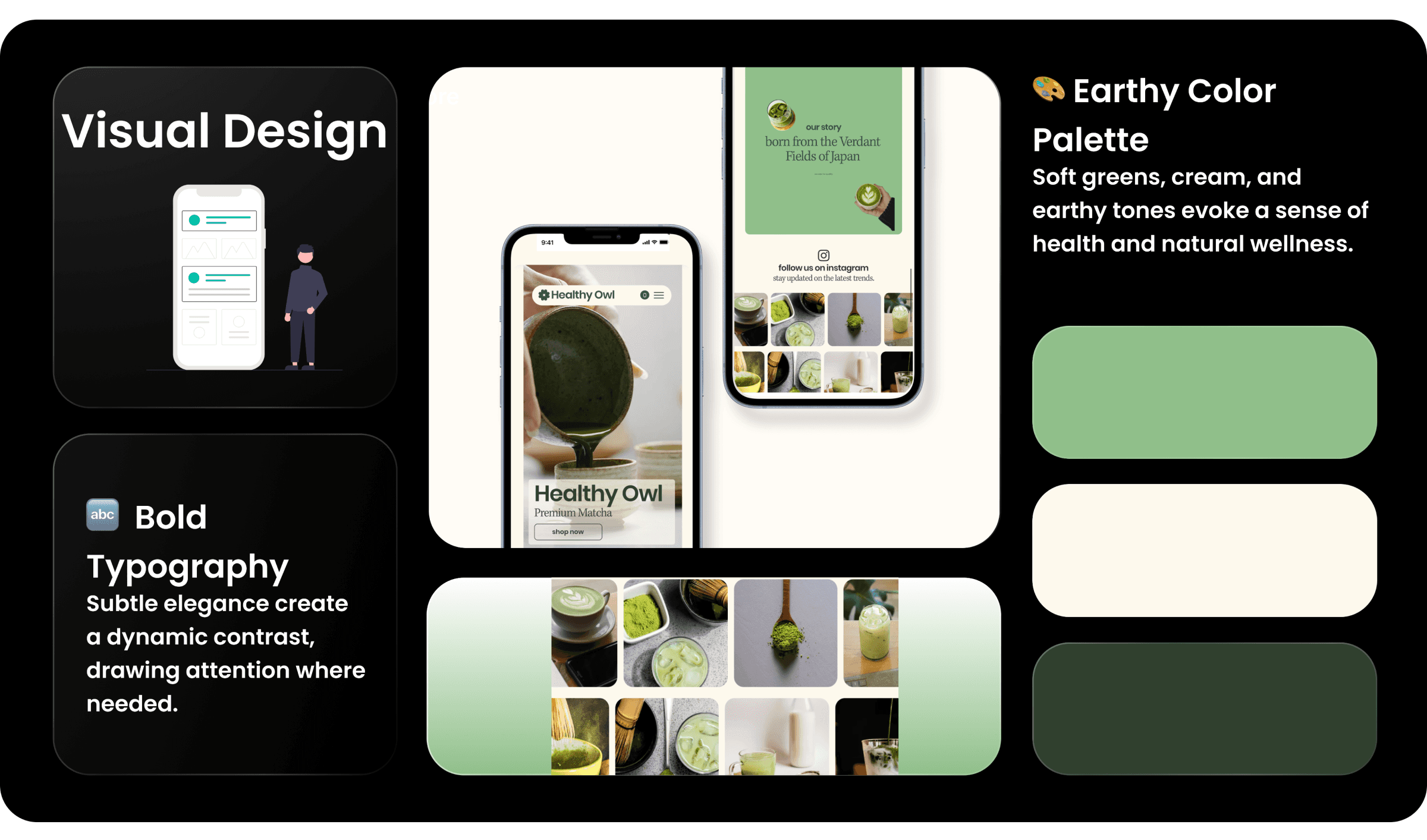
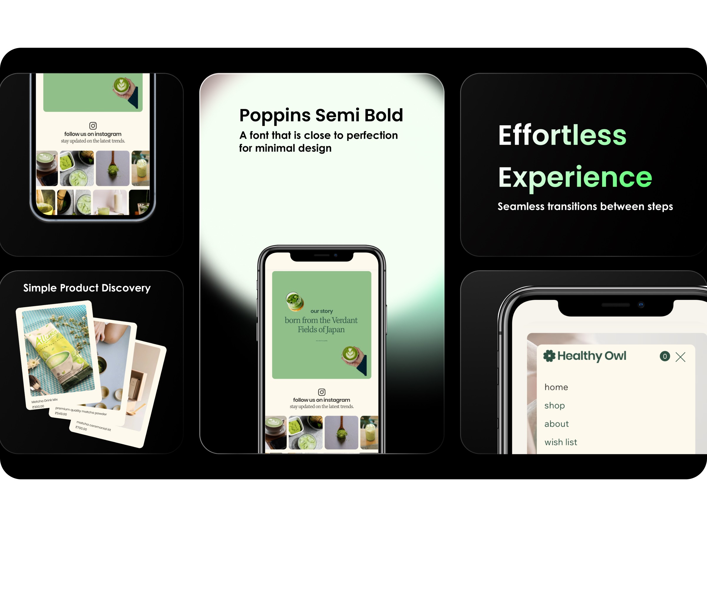
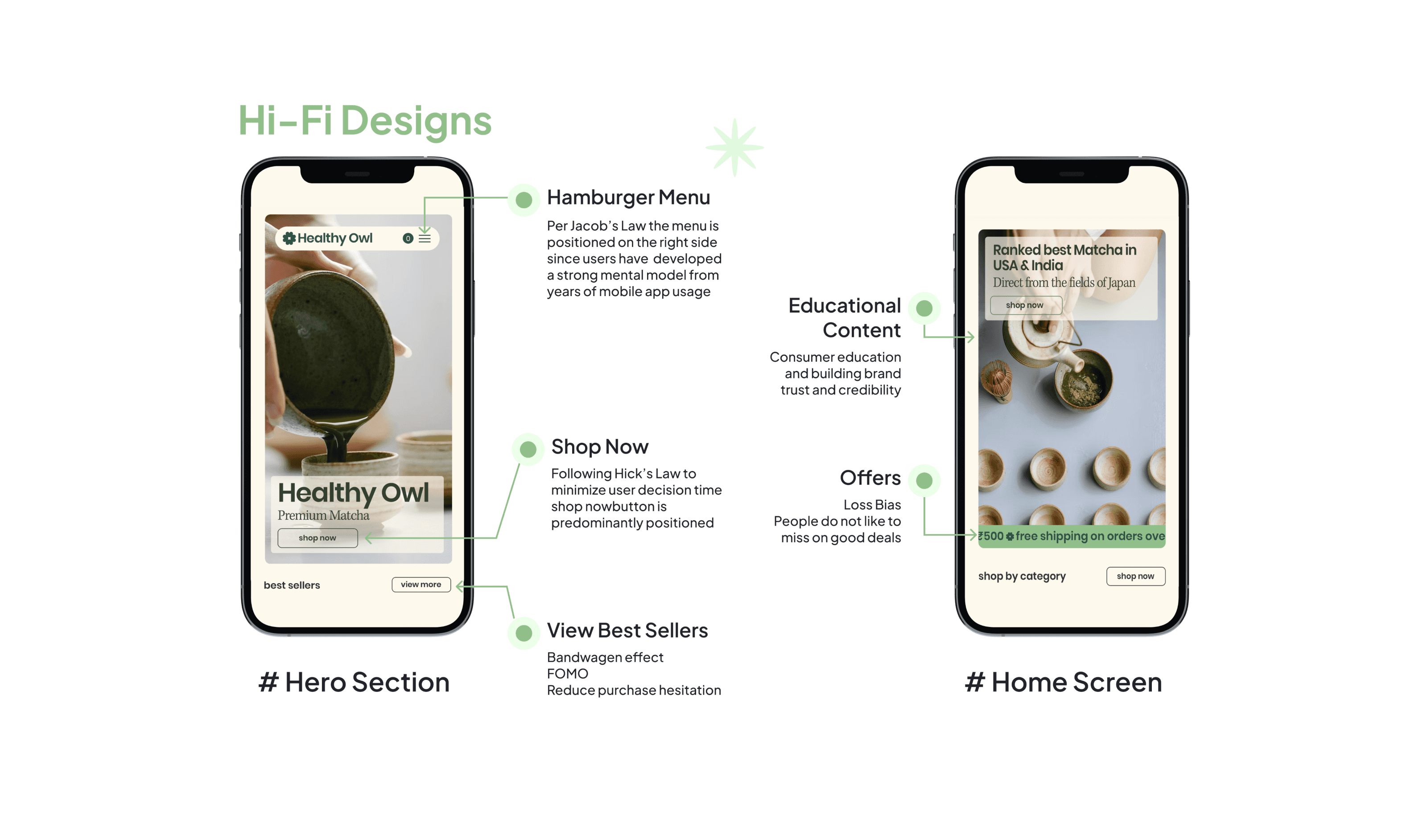
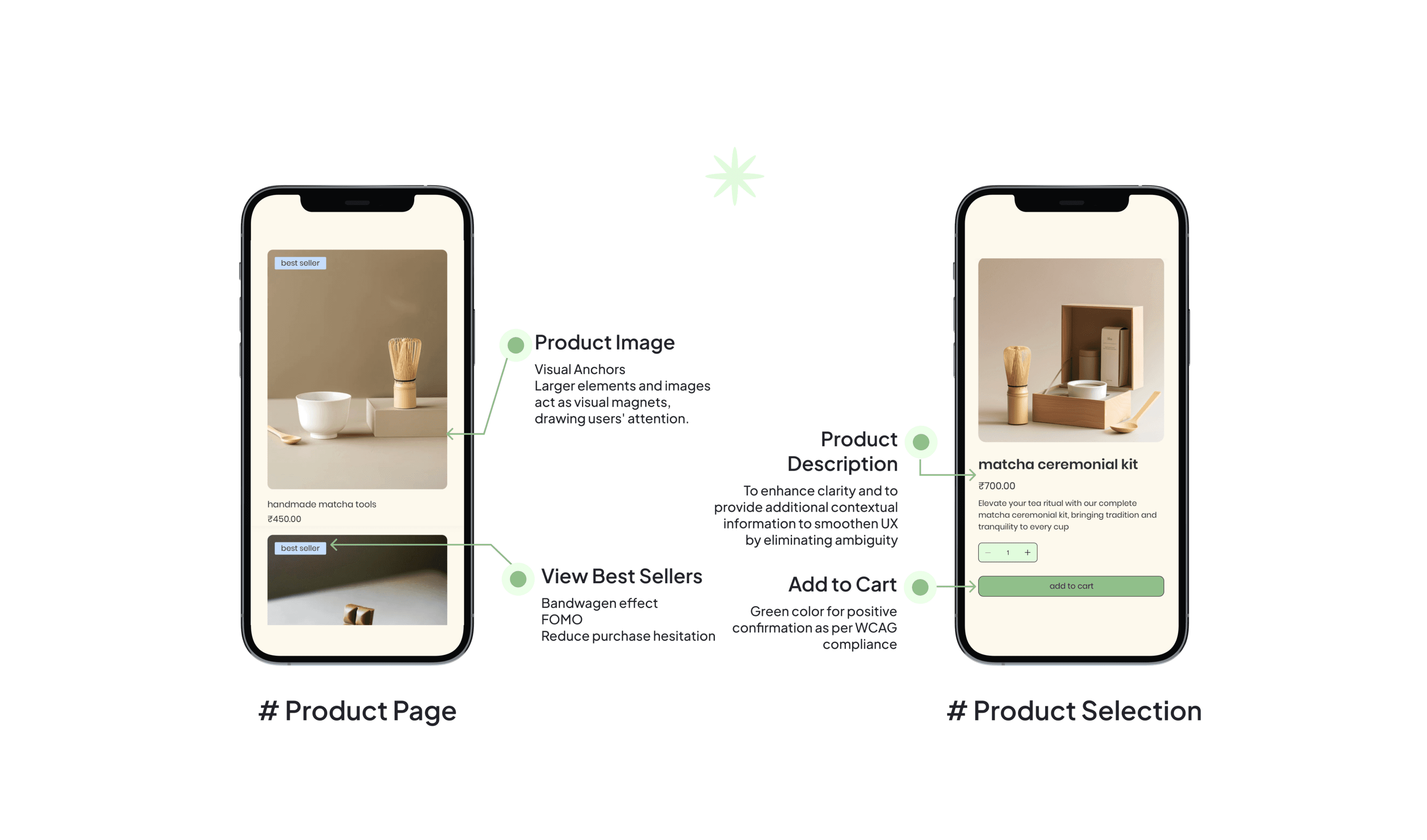
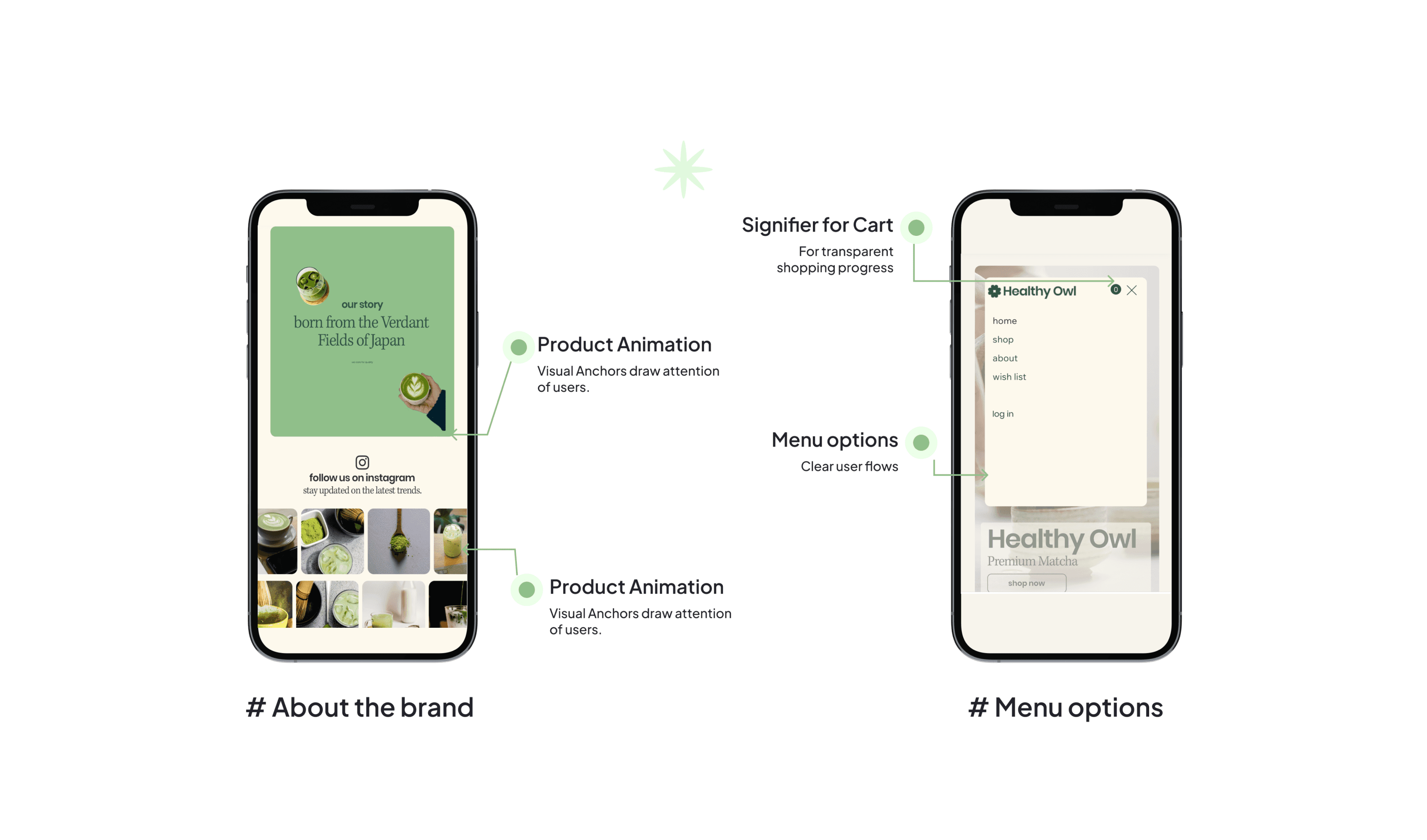
Key Features Introduced ⬇️
Every pixel, interaction, and element in the design exists for a specific purpose. The design decisions are not arbitrary but are carefully considered choices based on these fundamental principles-
Results and Impact 💹
Positive feedback highlighted the intuitive navigation and inspiring content. The intuitive interface increased the average time spent on the application, while customer satisfaction scores saw a marked improvement.
Next Steps ⏭️
Implementing social features like user reviews and recipe sharing to build a community.